7) Unit 78 Task 2 & 3
7.
To be able to generate my own concept art ideas for computer games graphics, I first had to understand what is my character going to be for; this time, I'm going to be creating the concept arts for a 2D side scroller game. This way, I'll also know what kind of character poses I'll be creating later on. The second step was to find examples, from different websites, books and more - anything, really, in life that could be useful - for the inspiration and ideas. This is why, after finding these inspirations, it's good to put them all together into one - a mood-board - and then take parts from them to create something original.
Here is the first mood-board I have created as an inspiration for my character:

However, the first attempts I have approached weren't very good for an interesting game. Such as those ones:

The idea and the design much more would suit an animation/ movie, rather than a game. This is why I have made more research into 2D side scroller games and came up with one more perfect idea for the character, with the help of images and a new mood-board.

This mood-board is much simpler but still just as useful. This time I have truly looked into games and what types are easy enough to be made as well as to be popular.
This is when I finally started to create the right body shape and accessories for the 'mecha' girl of my choosing that could fit a real game. This is what I came up with:

This character is supposed to be a girl, half robot half human that could also use 'magic', which was actually created by scientists, however, she ran away from that place and is starting to become more human-like than a numb, emotionless robot.
Nextly, I have looked at the clothing and made few experiments.
Then, I realized it'd be much better and more eye-catching if the mecha character would be turned into a chibi or a child. Which is why, after choosing the clothes, I then drew her in a chibi form with different, most typical, movement poses, such as jumping, running and sliding:

Finally, in order to be able to create the digital work of my character from all the sides, I had to make sure that all my drawings were accurate in both, the size and position; this is where I've learned to use lines between the parts of the characters to make sure they all will be in the right proportions; just as it is below.

Before starting my digital work, I've learned about the legal and ethical constrain. This type of characters are very popular in games, which would mean I could be violating some copyrights from an existing game. To make sure I'm not doing that, I've researched and made sure nothing like this will happen. To do with the ethical considerations, I created a character in such a way, it wouldn't 'seduce' boys at young age with her sexuality for example through creating larger intimate body places - that'd be very inappropriate. As I said before, it is crucial to take those constrains under the consideration.


After I was done with all the drawing works, I began to learn about the digital program - the "Illustrator". Here, I have learned few, very useful techniques of creating illustrator characters for games. The main tool I've been using is the "Pen Tool" (shortcut for "P"), used for creating lines - both, the straight and bent ones. While using that tool, it can create lines that contain the "stroke" as well as the "fill"; usually, at the beginning of creating the character, the "fill" is turned off so it'd be easier to see the outlines of the character that is being traced from.


Here we have an easy example of the lines with the fill and without it. Clearly, it is much easier to see and control the lines in a wanted way without having the fill.
 Before starting any digital 'drawing', I first needed to understand what are the "layers" for and how do they work. Layers are very simple, all you need to understand is the fact that whichever the layer is higher from others, that layer will be visible in the front of the other ones on the 'working page'. This is very important, as this way, the character can be correctly organized, for example, the eyes, of course, are 'on' the face and not under it, therefore, the layer with the eyes on them, needs to be above the layer with the face drawn on, otherwise, once they'd get colored, the eyes wouldn't be visible. Layers are very useful for segregations within drawings; let's say there are four sides of the character that needs to be drawn, it will be much better to segregate the four of them separately, instead of putting all of them into one. If that'd happen, everything would be mixed up together making it very difficult to find the correct layers that we'd like to use or lock or whatever we'd need them for - in particular, as there will be even more layers within that one layer with one side of the character. Additionally, naming the layers would be helpful too - this makes finding them even quicker and easier.

 Once I've learned how to cooperate with layers, I then started to use different shapes (shortcut for "M") along with the "Pen Tool" to get used to them. After exercising with them I began to, mostly, use the pen tool to trace my character (only with the stroke for easier visibility, in general, the fill wasn't needed not useful at all by that moment) and only in some parts actually use the shapes, such as the eyes, where it was much quicker to just use the "Ellipse Tool" instead of creating one myself. Next, when my whole character was completely traced, I began to play around with the "Stroke" as in some parts of my character, it was needed for them to be either thinner or thicker, for example, the eyelashes surely needed a thinner line, unlike the sword which needed a thinker line. At this point, my character was completed, and this is the result:
This was the coloring time.
 Firstly, I've learned how to create my own 'blend' of colors, which is like a gradient but in separate boxes so that I could later use them using the "Eyedropper Tool" - which is used for 'picking up' the chosen color, this will 'copy' the exact same color. To create such a 'gradient', (1) I had to create two boxes near each other and choose colors for them that I knew I'll want to use, and the in-between colors of those two. (2) Highlight them and go to the "Object" panel, then the "Blend" and "Blend Options..." (3) which will display the options I could use, such as the distance between the squares that I'm about to create, or how many of them I want. (4) Thirdly, go back to the "Blend" in the "Object" panel and choose "Make", at this point, the 'gradient' of colors should be made and ready to use.


(1) (2) (3) (4)


 For the final touch, I added shadows. Again, I've learned a new technique which allowed me to create these shadows much more efficiently. One, of course, is the movement and order of the layers, however, this technique uses the "Shape Builder Tool" (shortcut for "Shift + M"). This allows to combine two overlapping shapes together as well as get rid of some unwanted parts that, for example, are coming out over the wanted object, such as here:
 While highlighting two parts - the 'shadow' and the hand - and being in the "Shape Builder" mode, as well as holding the "alt" key (which will allow to 'take away'), move the cursor to the part we'd like to get rid of - just as it is dot-highlighted on the image - and click once. Using this process, I've finished my whole character and this is the final outcome:

This is my first time creating such a character in a digital program - the Illustrator - I understand, there could be some corrections needed, however, in my opinion, this is the very best I could do for the experience I have gained. I surely will improve over time, with practice.
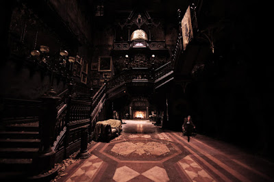
The Environment was another step of my concept art within the 2D side-scroller game development. Just like before, with the character, I used all the techniques I have learned and needed to use in this project. Of course, in the beginning, I did research and created a mood-board that I thought would fit the setting I'd like to have in a game.

Here are my inspirations for my own idea.
At this point, I've collected all of these images and placed them all into the Illustrator, around the page, making space for my own creations as well as having the images to trace from, make changes, and have an amazing outcome of something very new.
This is what it looked like at the very beginning:


 The technique uses "Gradient" (shortcut for "G"). This technique creates transitions between colors often adding volume to a flat object, creating lights and shadows. Once an object is being selected, in the gradient grid, you can choose the main colors we'd want to have the transitions between plus the in-betweens; which means, you can have many more varies of colors in just one object.


Unit 78, Task 2 & 3
To be able to generate my own concept art ideas for computer games graphics, I first had to understand what is my character going to be for; this time, I'm going to be creating the concept arts for a 2D side scroller game. This way, I'll also know what kind of character poses I'll be creating later on. The second step was to find examples, from different websites, books and more - anything, really, in life that could be useful - for the inspiration and ideas. This is why, after finding these inspirations, it's good to put them all together into one - a mood-board - and then take parts from them to create something original.
Here is the first mood-board I have created as an inspiration for my character:

However, the first attempts I have approached weren't very good for an interesting game. Such as those ones:

The idea and the design much more would suit an animation/ movie, rather than a game. This is why I have made more research into 2D side scroller games and came up with one more perfect idea for the character, with the help of images and a new mood-board.

This mood-board is much simpler but still just as useful. This time I have truly looked into games and what types are easy enough to be made as well as to be popular.
This is when I finally started to create the right body shape and accessories for the 'mecha' girl of my choosing that could fit a real game. This is what I came up with:

This character is supposed to be a girl, half robot half human that could also use 'magic', which was actually created by scientists, however, she ran away from that place and is starting to become more human-like than a numb, emotionless robot.
Nextly, I have looked at the clothing and made few experiments.
Then, I realized it'd be much better and more eye-catching if the mecha character would be turned into a chibi or a child. Which is why, after choosing the clothes, I then drew her in a chibi form with different, most typical, movement poses, such as jumping, running and sliding:


Before starting my digital work, I've learned about the legal and ethical constrain. This type of characters are very popular in games, which would mean I could be violating some copyrights from an existing game. To make sure I'm not doing that, I've researched and made sure nothing like this will happen. To do with the ethical considerations, I created a character in such a way, it wouldn't 'seduce' boys at young age with her sexuality for example through creating larger intimate body places - that'd be very inappropriate. As I said before, it is crucial to take those constrains under the consideration.

After I was done with all the drawing works, I began to learn about the digital program - the "Illustrator". Here, I have learned few, very useful techniques of creating illustrator characters for games. The main tool I've been using is the "Pen Tool" (shortcut for "P"), used for creating lines - both, the straight and bent ones. While using that tool, it can create lines that contain the "stroke" as well as the "fill"; usually, at the beginning of creating the character, the "fill" is turned off so it'd be easier to see the outlines of the character that is being traced from.


Here we have an easy example of the lines with the fill and without it. Clearly, it is much easier to see and control the lines in a wanted way without having the fill.


 Once I've learned how to cooperate with layers, I then started to use different shapes (shortcut for "M") along with the "Pen Tool" to get used to them. After exercising with them I began to, mostly, use the pen tool to trace my character (only with the stroke for easier visibility, in general, the fill wasn't needed not useful at all by that moment) and only in some parts actually use the shapes, such as the eyes, where it was much quicker to just use the "Ellipse Tool" instead of creating one myself. Next, when my whole character was completely traced, I began to play around with the "Stroke" as in some parts of my character, it was needed for them to be either thinner or thicker, for example, the eyelashes surely needed a thinner line, unlike the sword which needed a thinker line. At this point, my character was completed, and this is the result:
This was the coloring time.
Firstly, I've learned how to create my own 'blend' of colors, which is like a gradient but in separate boxes so that I could later use them using the "Eyedropper Tool" - which is used for 'picking up' the chosen color, this will 'copy' the exact same color. To create such a 'gradient', (1) I had to create two boxes near each other and choose colors for them that I knew I'll want to use, and the in-between colors of those two. (2) Highlight them and go to the "Object" panel, then the "Blend" and "Blend Options..." (3) which will display the options I could use, such as the distance between the squares that I'm about to create, or how many of them I want. (4) Thirdly, go back to the "Blend" in the "Object" panel and choose "Make", at this point, the 'gradient' of colors should be made and ready to use.


(1) (2) (3) (4)
Using these as helpers and techniques, I colored all of my characters and these are the results:


 For the final touch, I added shadows. Again, I've learned a new technique which allowed me to create these shadows much more efficiently. One, of course, is the movement and order of the layers, however, this technique uses the "Shape Builder Tool" (shortcut for "Shift + M"). This allows to combine two overlapping shapes together as well as get rid of some unwanted parts that, for example, are coming out over the wanted object, such as here:
 While highlighting two parts - the 'shadow' and the hand - and being in the "Shape Builder" mode, as well as holding the "alt" key (which will allow to 'take away'), move the cursor to the part we'd like to get rid of - just as it is dot-highlighted on the image - and click once. Using this process, I've finished my whole character and this is the final outcome:
This is my first time creating such a character in a digital program - the Illustrator - I understand, there could be some corrections needed, however, in my opinion, this is the very best I could do for the experience I have gained. I surely will improve over time, with practice.
The Environment was another step of my concept art within the 2D side-scroller game development. Just like before, with the character, I used all the techniques I have learned and needed to use in this project. Of course, in the beginning, I did research and created a mood-board that I thought would fit the setting I'd like to have in a game.

Here are my inspirations for my own idea.
At this point, I've collected all of these images and placed them all into the Illustrator, around the page, making space for my own creations as well as having the images to trace from, make changes, and have an amazing outcome of something very new.
This is what it looked like at the very beginning:

This looks pretty much like a disaster, right? This is how it always is at the start, however, after exercising, improving and learning a one new, a very useful and helpful technique, this turned into something much more beautiful and creative.

 The technique uses "Gradient" (shortcut for "G"). This technique creates transitions between colors often adding volume to a flat object, creating lights and shadows. Once an object is being selected, in the gradient grid, you can choose the main colors we'd want to have the transitions between plus the in-betweens; which means, you can have many more varies of colors in just one object.
Using these techniques, plus the opacity and duplications, there can be many amazing works and environments created through this. That is my absolute, final outcome:

or

Comments
Post a Comment