4) 2nd Photoshop Creation
4.
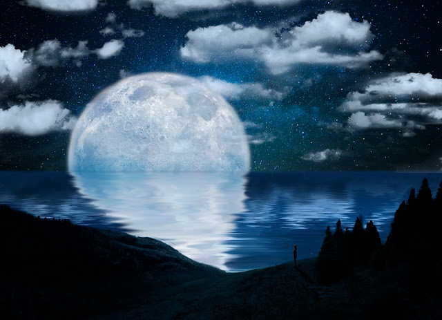
Here we have the final outcome. Now, let me go through all the new processes I have learned during this experiment.
Just like before, I made sure the new document I've created had a size of 145mm x 105mm and resolution of 300pixels/Inch, as well as made sure that all the pictures I've been choosing to create this image, also had minimum resolution of 2K.
 This is the first image I have chosen to begin with, I've cut out the ground of this landscape by again, masking the rest of the image typically, using the same tools I've talked about in my earlier work such as, the "magic wand", "quick selection tool" and a "brush". Then I just positioned it in the place I wanted it to be, with the right size using the "free transform" mode.
 Then, I chose another image for the water I wanted to add, to make it look like an ocean or a sea. Easily, I again masked the sky from from the rest using the basic techniques I've trained with earlier: the "rectangular marquee tool" and a "brush" to make the horizontal line look smoother and more realistic. Lastly, I positioned the water in a right place in my creation.
Next, I've found another image for my 'galaxy' sky I wanted and without any special techniques, I've placed it in a wanted position.
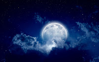 Thirdly, I found the image with the moon I found beautiful and also wanted to use it in my work so, once more, I've 'cut out' the moon by using the "lasso tool", going around the moon to roughly select it and "mask" it but, because the moon was selected instead of the rest, I then had to invert it with the "Command" plus "I" so that the moon would be visible and other parts masked. The moon has its reflection, so to make sure the 'cut out' wouldn't look so sharp, I again used the "brush" at a lower opacity, make it look really soft and realistic. Finally, I positioned it in a right place of the image.
Later on, to create the reflection of the moon on the water, I firstly duplicated the layers ("Com" + "J"), flipped it vertically, to fit the moon on the opposite side of it, and created a "Smart Filter"which can be found under the "Filter" panel. Quickly, to also fit the depth of the view on the image, I used the "Perspective" option in the "Transform" that is found under the "Edit" panel, which allows me to evenly transform the 'reflection' of the moon in a perspective way.
-Smart Filer is a lossless conversion, which means that we can always go back to the layer and change it without changing the original image whenever we want, which also means that even after saving the work, we can still keep on manipulating the options.
Secondly, (that's where I started to again learn new to me techniques) I added the "Motion Blur" -which is used to create a blur in a specific angle but just in a one direction. Also, its distance is controllable (the higher the distance the more blurred the image is) and can be found in the "Filter" panel, under the "Blur" option. This created a blur in one direction, along with the water, to make it look like it really is on the water however, to make it look even more realistically, I then used the "Smudge Tool" with different sizes, to smudge the 'reflected moon' back and forth to create the 'movement' on the water. Of course, before smugging it, I duplicated the layer, just in case if something would go wrong.
After doing all that, I realized, there is a lightning on the water, but not the one created by me, but the one from the reflection of the moon I have cut out earlier. To fix that, I duplicated the layer with the water (constant duplicating and saving work is very important) and again, used the "smudge" tool, to make sure, the flow of the water would still be visible; seemed like this was the best technique to use by that time to cover it. Everything went right with the plan and looked perfect. What I'm trying to show here is that, it is important to look at everything in detail and if something looks off, it needs to be fixed.
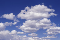 Thirdly, I added an image with the clouds I wanted to use for my work. Of course, I didn't want the blue sky to be visible but only the clouds. That's why, after some research I found out that I could easily camouflage the sky by double clicking on the 'cloud layer' - which then would show the "Layer Style" that can also be found under the "Layer" panel and the "Blending Options..." - and then I made sure the "Blend If:" option is on "Gray" because then, using the "This Layer:" arrow, I could move the left one to the right, which means, it would 'mask' the darker places on the image. After doing that, clearly the image wasn't ready because of the dark, but lighter details near the clouds; to still be able to cover it, I then had to separate the arrow I was just using by holding the "Alt" button and then moving the right side of it to the right - this then covered even more of the darker unwanted colors from the clouds.
Afterwards, I positioned the clouds in a right place I realized, they don't really compose themselves very well with the sky and the moon because of the wrong atmosphere; the clouds were too grayish- whitish. To overcome this problem, I had to make the color of the clouds look similar to the rest of the image, in particular to the moon as the moon was the one giving off the light. There are a few ways to do so, this time I used the "Soft light" style of an image (there are many different 'styles' such as, "color" or "soft light" or "normal" etc.) and added the "Solid Color" from the "adjustments", choosing the color from the moon light and the sky using the "Eyedropper Tool" (shortcut for "I") and applying it. This created a perfect 'filter' for the clouds however, because the layer was above all the other layers, it affected everything and not only the clouds; to fix this all I did was "Create Clipping Mask" - shortcut for "Alt" + "Com" + "G" - which clipped the created 'filter' to only the layer below it, which was the 'cloud layer'.
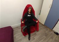
Finally, I've pasted my 'cut out' self that I made last time for this project; as always, firstly, I "free transformed" myself into a smaller version, then duplicated it for the same reason as always but this time, I actually used it. On one of the layer with the human, I used a normal brush and colors to paint it black as a shadow and a bit of light at the 'front' of her because of the moon's light. To make sure I wouldn't paint on anything else but her, I selected the person with the typical "magic wand" and then used the brush. After drawing on her, I changed the opacity to a bit lower level so the layer below it with myself would still be a tiny bit visible; to reveal some outlines of the person than having just the solid colors. After, I "merged" the two layers using the shortcut of "Com" + "E", it became one allowing me to again "free transform" it into a perfect size and position.
This was the time to create a real shadow of this human 'created' by the moon light. I chose the layer of the human (as this is what I want the shadow to be created of), and used the "Drop Shadow..." in the "fx." panel - to create a shadow behind this object. To separate the shadow from the object, I right clicked on the layer and "create layer" which then allowed me to move the shadow separately, which then allowed me to use the "Distort" in the "Transform" options found under the "Edit" panel. "Distort" is a type of transform tool that lets me move - this time - a shadow in any way I wish to. Easily, I positioned the shadow in a correct place with the right proportions to the moment and the human.
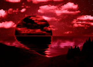 Here, I have been experimenting a bit with "filters" that are used to change the color of the overall picture, of your own choice, ("Photo Filter..." is found in the "adjustments") such as here I have used the color red creating a dark, creepy, and bit an apocalyptic-like atmosphere just by adding an easy filter.
Now, I knew what it's like to use those settings, that's why I could use them to correct some parts of the scene such as the 'ground' of my image.
This land needed to have a bit more filter added with the color of the light of the moon, again, to make it fit the overall image; that's why, I firstly selected the land using a "quick selection tool", and just as before, added a "photo filter" choosing the color of the moon with the "Eyedropper" tool. Additionally, I made sure the "Preserve Luminosity" option was off while adding the filter, which allowed the land still look as dark as it was before, but just added a bit of that 'transparent-like' color to it.
Lastly, I used the "Curves" on the whole image to add a bit of that contrast and brightness to it, to make it look more like it is a beautiful, dark, night time.
My Second Photoshop Creation - "That One Day"

Here we have the final outcome. Now, let me go through all the new processes I have learned during this experiment.
Just like before, I made sure the new document I've created had a size of 145mm x 105mm and resolution of 300pixels/Inch, as well as made sure that all the pictures I've been choosing to create this image, also had minimum resolution of 2K.
 This is the first image I have chosen to begin with, I've cut out the ground of this landscape by again, masking the rest of the image typically, using the same tools I've talked about in my earlier work such as, the "magic wand", "quick selection tool" and a "brush". Then I just positioned it in the place I wanted it to be, with the right size using the "free transform" mode.
 Then, I chose another image for the water I wanted to add, to make it look like an ocean or a sea. Easily, I again masked the sky from from the rest using the basic techniques I've trained with earlier: the "rectangular marquee tool" and a "brush" to make the horizontal line look smoother and more realistic. Lastly, I positioned the water in a right place in my creation.
Next, I've found another image for my 'galaxy' sky I wanted and without any special techniques, I've placed it in a wanted position.
 Thirdly, I found the image with the moon I found beautiful and also wanted to use it in my work so, once more, I've 'cut out' the moon by using the "lasso tool", going around the moon to roughly select it and "mask" it but, because the moon was selected instead of the rest, I then had to invert it with the "Command" plus "I" so that the moon would be visible and other parts masked. The moon has its reflection, so to make sure the 'cut out' wouldn't look so sharp, I again used the "brush" at a lower opacity, make it look really soft and realistic. Finally, I positioned it in a right place of the image.
Later on, to create the reflection of the moon on the water, I firstly duplicated the layers ("Com" + "J"), flipped it vertically, to fit the moon on the opposite side of it, and created a "Smart Filter"which can be found under the "Filter" panel. Quickly, to also fit the depth of the view on the image, I used the "Perspective" option in the "Transform" that is found under the "Edit" panel, which allows me to evenly transform the 'reflection' of the moon in a perspective way.
-Smart Filer is a lossless conversion, which means that we can always go back to the layer and change it without changing the original image whenever we want, which also means that even after saving the work, we can still keep on manipulating the options.
Secondly, (that's where I started to again learn new to me techniques) I added the "Motion Blur" -which is used to create a blur in a specific angle but just in a one direction. Also, its distance is controllable (the higher the distance the more blurred the image is) and can be found in the "Filter" panel, under the "Blur" option. This created a blur in one direction, along with the water, to make it look like it really is on the water however, to make it look even more realistically, I then used the "Smudge Tool" with different sizes, to smudge the 'reflected moon' back and forth to create the 'movement' on the water. Of course, before smugging it, I duplicated the layer, just in case if something would go wrong.
After doing all that, I realized, there is a lightning on the water, but not the one created by me, but the one from the reflection of the moon I have cut out earlier. To fix that, I duplicated the layer with the water (constant duplicating and saving work is very important) and again, used the "smudge" tool, to make sure, the flow of the water would still be visible; seemed like this was the best technique to use by that time to cover it. Everything went right with the plan and looked perfect. What I'm trying to show here is that, it is important to look at everything in detail and if something looks off, it needs to be fixed.
 Thirdly, I added an image with the clouds I wanted to use for my work. Of course, I didn't want the blue sky to be visible but only the clouds. That's why, after some research I found out that I could easily camouflage the sky by double clicking on the 'cloud layer' - which then would show the "Layer Style" that can also be found under the "Layer" panel and the "Blending Options..." - and then I made sure the "Blend If:" option is on "Gray" because then, using the "This Layer:" arrow, I could move the left one to the right, which means, it would 'mask' the darker places on the image. After doing that, clearly the image wasn't ready because of the dark, but lighter details near the clouds; to still be able to cover it, I then had to separate the arrow I was just using by holding the "Alt" button and then moving the right side of it to the right - this then covered even more of the darker unwanted colors from the clouds.
Afterwards, I positioned the clouds in a right place I realized, they don't really compose themselves very well with the sky and the moon because of the wrong atmosphere; the clouds were too grayish- whitish. To overcome this problem, I had to make the color of the clouds look similar to the rest of the image, in particular to the moon as the moon was the one giving off the light. There are a few ways to do so, this time I used the "Soft light" style of an image (there are many different 'styles' such as, "color" or "soft light" or "normal" etc.) and added the "Solid Color" from the "adjustments", choosing the color from the moon light and the sky using the "Eyedropper Tool" (shortcut for "I") and applying it. This created a perfect 'filter' for the clouds however, because the layer was above all the other layers, it affected everything and not only the clouds; to fix this all I did was "Create Clipping Mask" - shortcut for "Alt" + "Com" + "G" - which clipped the created 'filter' to only the layer below it, which was the 'cloud layer'.
Finally, I've pasted my 'cut out' self that I made last time for this project; as always, firstly, I "free transformed" myself into a smaller version, then duplicated it for the same reason as always but this time, I actually used it. On one of the layer with the human, I used a normal brush and colors to paint it black as a shadow and a bit of light at the 'front' of her because of the moon's light. To make sure I wouldn't paint on anything else but her, I selected the person with the typical "magic wand" and then used the brush. After drawing on her, I changed the opacity to a bit lower level so the layer below it with myself would still be a tiny bit visible; to reveal some outlines of the person than having just the solid colors. After, I "merged" the two layers using the shortcut of "Com" + "E", it became one allowing me to again "free transform" it into a perfect size and position.
This was the time to create a real shadow of this human 'created' by the moon light. I chose the layer of the human (as this is what I want the shadow to be created of), and used the "Drop Shadow..." in the "fx." panel - to create a shadow behind this object. To separate the shadow from the object, I right clicked on the layer and "create layer" which then allowed me to move the shadow separately, which then allowed me to use the "Distort" in the "Transform" options found under the "Edit" panel. "Distort" is a type of transform tool that lets me move - this time - a shadow in any way I wish to. Easily, I positioned the shadow in a correct place with the right proportions to the moment and the human.
 Here, I have been experimenting a bit with "filters" that are used to change the color of the overall picture, of your own choice, ("Photo Filter..." is found in the "adjustments") such as here I have used the color red creating a dark, creepy, and bit an apocalyptic-like atmosphere just by adding an easy filter.
Now, I knew what it's like to use those settings, that's why I could use them to correct some parts of the scene such as the 'ground' of my image.
This land needed to have a bit more filter added with the color of the light of the moon, again, to make it fit the overall image; that's why, I firstly selected the land using a "quick selection tool", and just as before, added a "photo filter" choosing the color of the moon with the "Eyedropper" tool. Additionally, I made sure the "Preserve Luminosity" option was off while adding the filter, which allowed the land still look as dark as it was before, but just added a bit of that 'transparent-like' color to it.
Lastly, I used the "Curves" on the whole image to add a bit of that contrast and brightness to it, to make it look more like it is a beautiful, dark, night time.

Comments
Post a Comment